A Conversation with Mario Sánchez Nevado

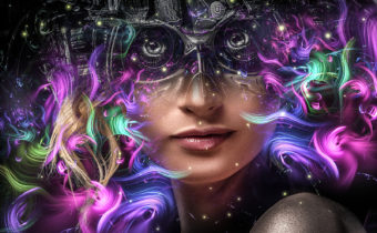
Hi Mario. I’m a big fan. It’s an honor to be able to chat with you. I’d like to discuss a few of your most recent pieces of art; what went into them and a little about your process. Let’s start with Medea. How did you come up with the idea for her hair, and are those jellyfish tentacles making up her hair?
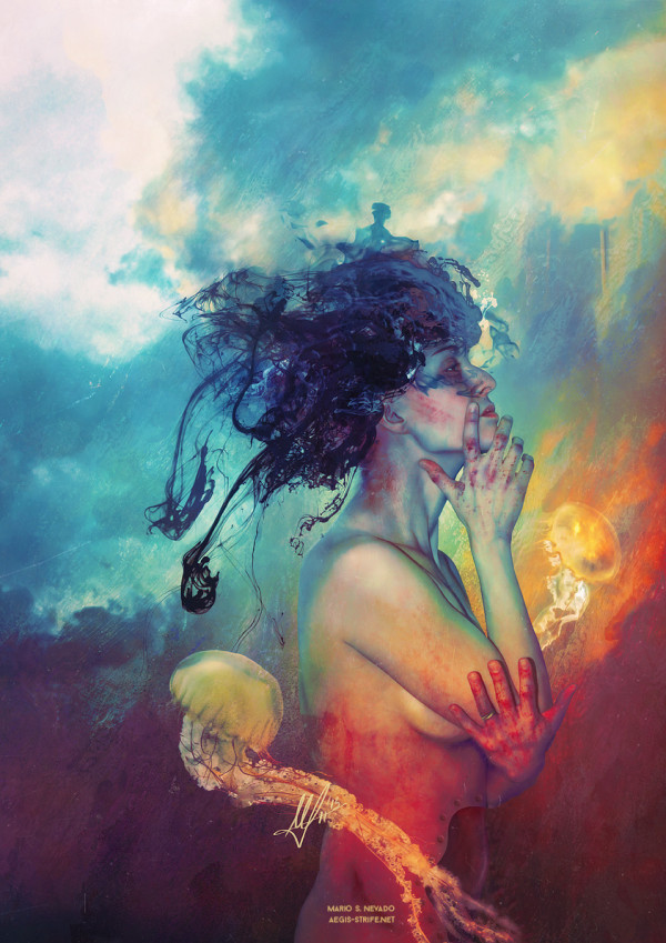
Hello, and thank you for the interest on my work! At the beginning of 2015 there was a concept that was surrounding my mind all the time, and that was duality. I ended up with the conclusion that depicting the myth of Medea would be the perfect fit to solve this puzzle.
Medea is one of the most complex characters in classic Greek mythology. She’s usually depicted as a vengeful character, full of hatred, but the real fact is that very few people during Art History has taken in mind the full story of this character, therefore knowing the reasons and contexts that pushed her to get involved into the disaster that her story depict to us.
It is said, that for each artist, at least once in a lifetime, a representation of Christ cannot be missed within the collection, regardless of personal views on the religious matter itself. I dare to add, in that essential gallery, that a vision of Medea is also mandatory, as her myth perfectly shows the issue on moral duality on us, human beings, and depending on the final view of the artist, we can, most likely, be able to see beyond the veil and discover true beliefs and moral opinions. Medea suffers, brings back suffering to others, just to end up getting it back, once more… over and over, during her endless odyssey that, most ironically, finishes on the Elysium, probably because the intervention of her grandfather Helios, the very god of the Sun. Medea is battered and betrayed, an empowered survivor that in the end is forgiven regardless of her countless crimes.
Only in Elysium, Medea will have enough time and maturity to look in retrospective, with pride upon the suffered, and with stoic remorse for the faults. There, striped form her earthly condition, she will just be able to confront eternity in company of beautiful but poisonous jellyfishes, in memory of the two sons murdered by her own hands (according to most sources – jellyfishes are my way to show something that is beautiful but hurts), that will just show the irony and duality of her own story.
This inherent duality on Medea just dramatizes in the extreme the case of duality in us, human beings, morally and emotionally, everyday, for our lifetimes. Human beings are not absolute: we are mutating polyhedrons in function of different contexts. Who couldn’t, if given the case, end up becoming a Medea?
The process of the piece consisted in a photo session with the model Cristina Martín and then overpainting everything else. The hair is just black ink and smoke. I created it this way to push the contrast between the ever colorful Elysium and her inner suffering.
Where do you get your source materials from? Did you photograph the model and jellies?
I shoot them myself, most of the time. There are certain things, like the jellyfishes, that are quite hard to photograph, so I tend to use royalty-free stock photos for stuff I cannot shoot myself, but I try to get all the source materials, either by photographing them, painting them or modeling them in 3D.
This piece has quite a wide color palate. How do you decide on your color scheme?
Usually, I try to use very vivid color palettes since most of the concepts and feelings I want to talk about have a heavy dark side to them, and it’s my intention to show the world that creating something that looks like the opposite, you can still feel the darkness in a second lecture. There’s no need to end up doing the obvious thing, desaturating colors and creating a gloomy palette. Everything is possible with a bit of thought to it.
In this case, it was clear. Medea is a very, very dark character. She’s hurt to her core, she seeks vengeance, and she only gets more pain in return. I wanted to create a character in her aftermath, which has been suffering. But her final context is an eternal life in Elysium, which is the equivalent to Christian heaven and everlasting happiness. It had to be bright and colorful to create a heavy contrast with the character. I wanted to show that a tortured individual doesn’t need to end up with a tragic end, at least for once.
Let’s take a look at another one of your 2015 pieces; Shelter. Did you have a complete vision of this piece before you started, or did it evolve as you worked on it?
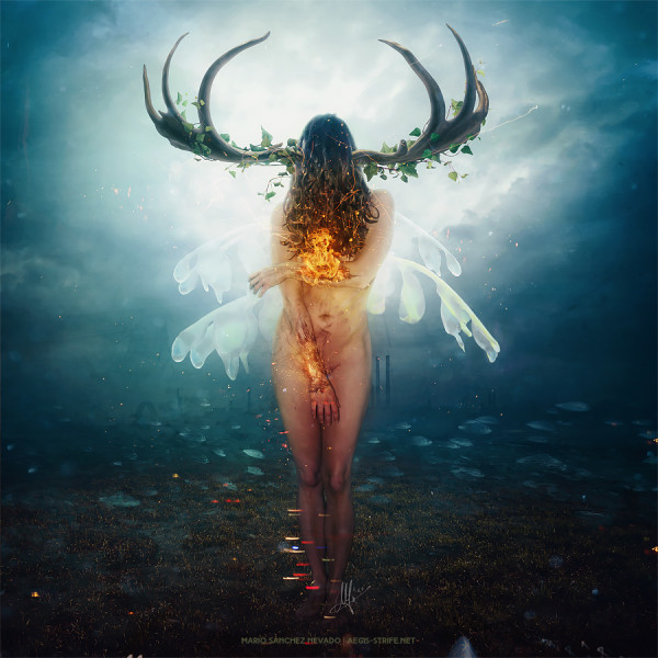 I rarely have my ideas clear before starting a piece. I prefer to go with the flow, do random things, and then see what my subconscious is trying to tell me, and then make a plan from there. This image came from the very same photo session I did for Medea. I shoot the poses I needed and then we spent some more time to improvise and get more photos so I could hopefully work with them in other projects, if needed. I liked this pose and started to randomly work on it, until I noticed what I was trying to say and then modeled it to its final form.
I noticed that fire is a recurring element in your work, and is present again here in Shelter. Why so much fire in your portfolio?
One of the key points of my narrative is nature, and one of the key things we find in nature, are the elements. I try to make them present in everything I create. Fire and water are the most easy to work with and they create the perfect dialogue about duality that I’ve been seeking lately, because they’re opposites but neither of them is good or bad.
I guess fire usually end ups as a main icon of my work because sometimes it represents something that hurts (but doesn’t kill), it means purification but also, it means strength. Fire itself is something very ambiguous and I like the context it gives to depict certain feelings on art.
How do you achieve such realistic fire effects in Photoshop?
I just use real fire photos in Screen blending mode, and then I paint the dark tones behind the layers to achieve a realistic effect. To add more realism I use photos from sparks or just mess around painting stuff.
Another great image of your from 2015 is Tremors. This piece has a very painterly feel to it. Did you get that effect by painting around the model in Photoshop or by using textures and overlays etc.? Or, a combination?
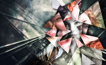
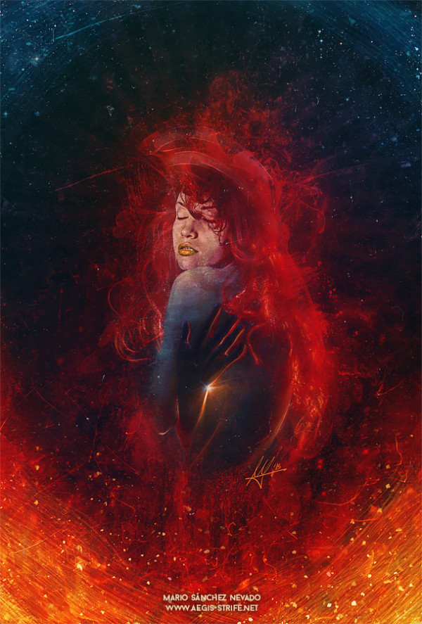 Most of my work is photography based but also, most of them is overpainted to achieve this look and feel. ‘Tremors’ was an experiment because I wanted to create something using mostly the neglected Difference blending mode, so it was a play on which I would overlay layers and strokes in Difference until I was able to reach a tonal middle point. Lots of textures were also applied in Difference. Usually, when you see a piece from me with a ‘painterly’ feel to it, it’s because it’s actually painted. I don’t think you can achieve a real painting effect only overlaying textures: instead you end up with a very messy, dirty artwork.
Your titles are often very short, but don’t always seem descriptive of the art. How do you come up with your titles?
Making titles is something hard for me. I consider it’s a very important part of the visual interpretation of something, even if the image should speak by itself without external help. Sometimes they come first, and then the image, but most of the time it is the opposite. I try to find what’s the core of what I’m doing, the main sensation, feeling or concept, and I try to find a correct title coming from there. Sometimes it’s more complex or poetic, but mostly, I tend to choose short, conceptually-cold titles that show my intentions for the artwork without adding any connotations, because I want each viewer to interpret my images in any way they want, regardless of my intentions. That’s the magic of art.
I have two questions I’ve been dying to ask you. They are not image specific, but I think our Shift Art members would love to know. I read on your blog a while back about some of your favorite post-production techniques. One that has stuck with me, and one that I now use all the time (thanks!), is to create a stamp of all layers, set it to soft light and blur it significantly. Then play with the opacity for some fantastic atmospheric effects. Do you have any new post processing gems you would care to share with our members?
I’m glad some of my tricks are useful! Right now I’m teaching two new tips on my workshops with Adobe. The first one is to Stamp All Visible Layers and then make a Smart Object out of it to apply a Camera Raw filter, which is the ultimate tool for color and light correction. Another one is to pick a color, fill a layer and set to Difference with 10% opacity or less. It will kill maximum whites and blacks and bring everything to the middle point of the histogram, bringing awesome toning most of the time. It’s very recommended for cross-processing and for filtering images, although I just use it to add small color touches or atmosphere.
Do you use Photoshop plugins, or do you create art purely with built in Photoshop tools? (If plugins, which plugins do you love?)
No, I don’t. I’ve got everything I need inside Photoshop, besides modeling in 3D, for which by now I only use Daz Studio with Iray Engine for rendering.
Leave Comment